
Colour Management
Introduction
Colour management is fundamental to all design practice, but it is easy to tie yourself in knots trying to figure it out! I've known seasoned designers who refuse to engage with it and simply hope to ‘wing it’ with their colour choices, so afraid are they to engage with the subject. Colour is a far more complex subject and this is no more than a brief introduction to the subject, that I hope serves to encourage you to research it futrther.
Perception
The issue with colour is that it is perceived by us in different ways. You cannot be sure that what you see is exactly what your colleague also sees, eye sight colour deficiencies aside. Note how people may all describe a color they are looking at in different ways; it’s pink, it’s crimson, it’s magenta, etc. Furthermore, colour can change dependent upon light levels, the colour temperature of ambient light and even by what other colour is adjacent to it.
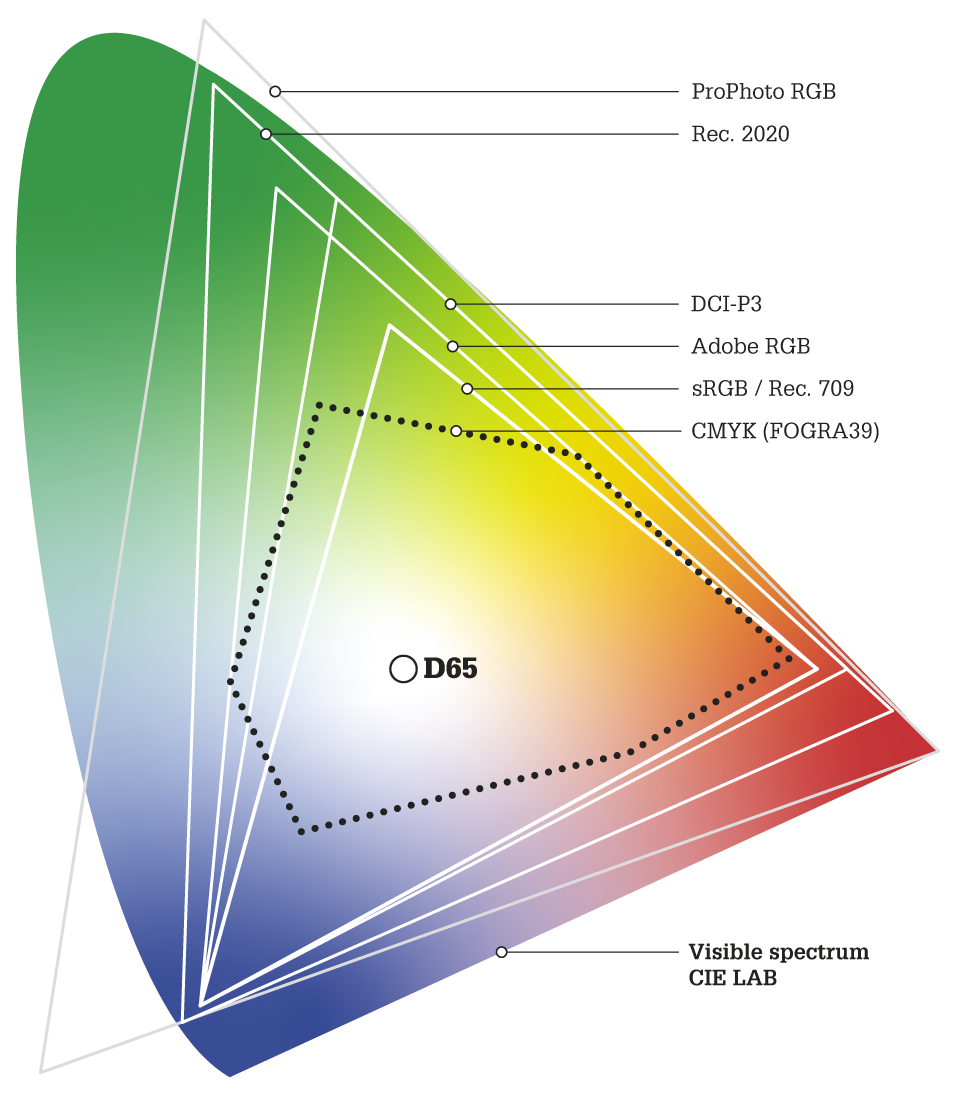
Whilst this diagram is suggestive of colour gamuts for different spaces, it itself is captured and rendered in sRGB… therefore not accurately representing those colours outside of that gamut!
Captured Images
In respect to images, it’s important to understand the colour space they were captured in, or the profile assigned to them through editing. Most DSLR cameras will capture images in AdobeRGB, a wide gamut favoured by professional photographers. At the very least, images will be captured in sRGB, what is becoming a default / defacto standard across a lot of media. Some cameras can even capture images in ProPhoto RGB, theoretically, the maximun capture possible.
Digital Devices
To add to the confusion, physical media and digital devices also render the same colour in different ways. The diagram here demonstrates the differences in colour gamuts between some common colour spaces. The sRGB colour space is the default for online content (websites, etc.) and is rendered quite accurately by most screens, whether mobile phone, tablet, laptop or desktop monitor. That said, not all devices are equal. Some high end products have wider gamut screens, such as DCI-P3. This allows you to see more of the visible spectrum than sRGB, as demonstrated by the diagram… providing your viewing device is capable of doing so!
Film and TV
These also have their own colour spaces, shown as REC. 709 and Rec. 2020 (standard and high-definition TV). There are numerous vriations on these spaces, but I will not expand on them here. Just note their existence.
Print Outputs
The same variations occur with print. Only one (common) print color space is shown here, CMYK (FOGRA39). This serves as a ‘typical’ output on coated paper. Uncoated paper would render the same colour differently, as would different presses, ink types and paper types. Screen calibration is important. It’s not just colour. Don’t forget lumimance settings as prints tend to look darker than screen renders; one uses a subtractive colour model, the other an additive model. Yet more complication!
A CMS Workflow
To enable us to work with colour in any meaningful way, or at least in a professional way, a Colour Management System (CMS) is used as part of an end-to-end workflow. For example, if you were producing a full colour document, you may set up your CMS as follows:
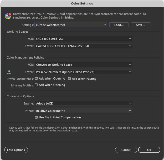
The Adobe Illustrator Color Settings dialogue box
You will see that there are numerous refinements and additional settings that you can make that allow for dozens of different conditions. This dialogue seems relatively complicated in itself, but its hiding even more complexity. The CMS sets up your document for the chosen output, in this case CMYK print, so whatever your document contains in terms of images and coloured graphics and text, the screen will be showing you how those objects will look when printed.
D65
D65 is a standard daylight illuminant, the reference point of white in the visile light spectrum. It is the standard for computer monitors and other colour spaces shown on the previous diagram. It is widely used by designers and photographers as the white point that generates the most accurate colour; not too warm and not too cold. That said, D50, which is a warmer white, is often used to view and proof physical printed proofs.
Transformation Space
So far, there’s been no mention of the colour space that’s used to trnasform colour from one profile to another. This is normally the CIELAB space, with a greater gamut than anything else, it ensures nothing is lost in the transfer other than that which the origin and destination profiles differ. By now, you probably realise how easy it is to tie yourself in knots with colour!
Pantone Colours
If you use Pantone colours in your software application, you’ll see that they are defined in the CIELAB colour space in order to render them properly, though that is still dependent upon your other colour settings, and your monitor’s colour space ability. If you need to see what that Pantone colour actually looks like you would (arguably) NOT manage them, per se, as many exist outside of the CMYK and RGB gamuts. Again, as mentioned earlier, the value and success of this is also dictated by the gamit of your screen. You might do this if Pantone colours were being used as custom colours in a print process, something increasingly uncommon these days but was often adopted in advanced cartographic printing in the past. This thinking also applies to other specialist colour libraries like RAL.
In Summary
Yes, CMS is actually very complicated, with some complex maths involved, but it is fundamental to design workflows to ensure colour accuracy and consistency across different devices and media. Without it, it just becomes a total guessing game. If you get your head around all this, you are in a good place, and you can start thinking about how colour then also changes to those with different forms of colour blindnes. How to control colour that looks wrong and right at the same time!
I hope this hasn’t confused thing further?